Good responsive design scales up (as well as down)
Like usability before it, responsive web design has been one of those topics that everyone tends to agree is a good idea. Of course websites should work on different devices. Yes, it makes sense for a single content management system to manage the content across all screen types/sizes.
Whilst there’s still plenty of room for debate around exactly how a responsive web design cascades down to mobile and tablet screens, one topic that we haven’t seen discussed is how designs scale-up to larger screens.
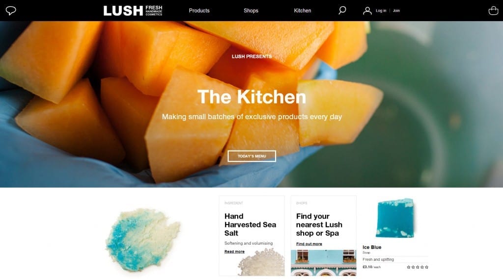
Econsultancy’s recent article gathered together 12 examples of good responsive designs that make use of a larger screen. Of even more value is the stats they pulled together to look at the screen sizes of visitors to their website.
With 20% of their visits coming from a user with a screen width of 1920 pixels or more, the reality is that they have more visitors using large screens than using smartphones. That insight takes the responsive debate to some interesting new places.
https://econsultancy.com/blog/64700-12-upwardly-responsive-websites-designed-for-big-screens


